
How to use Theming
Theming Page Overview
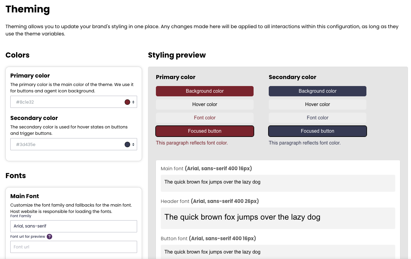
The Theming page allows you to manage the styling of your chat interface from a single location. Any changes made here will apply to all interactions within the selected configuration, as long as theme variables are used.
This page also includes a contrast checker to ensure your design meets WCAG accessibility guidelines.
Available Settings
Colors
Primary color: Used for buttons and the agent icon background.
Secondary color: Applied to hover states on buttons and trigger buttons.
Fonts
Please note that the chat application does not host fonts.
Custom fonts must be hosted on your own website.
Main font: Set the font family and fallbacks for all general text.
Header font: Optional. Set a separate font and fallback for headers.
Button font: Optional. Set a separate font and fallback for buttons.
Use the checkboxes in the admin interface to enable custom fonts for headers and buttons. If these are not selected, the Main font will be used for all elements.
Outline
Customize the color and width of the outline that appears around focused elements, improving keyboard navigation and accessibility.
Breakpoint
Define the CSS breakpoint where the interaction switches to fullscreen mode. You can set a specific pixel value or disable fullscreen entirely—for example, to prevent the interaction from switching to fullscreen on mobile devices or smaller screens.
The screenshot shows how the admin interface look. Some of the functionality is rolling out gradually second half of 2025, if you as a customer are not able to access or see all of the functionality reach out to Puzzel Support to request access.