
My Performance tab
Tab Menu
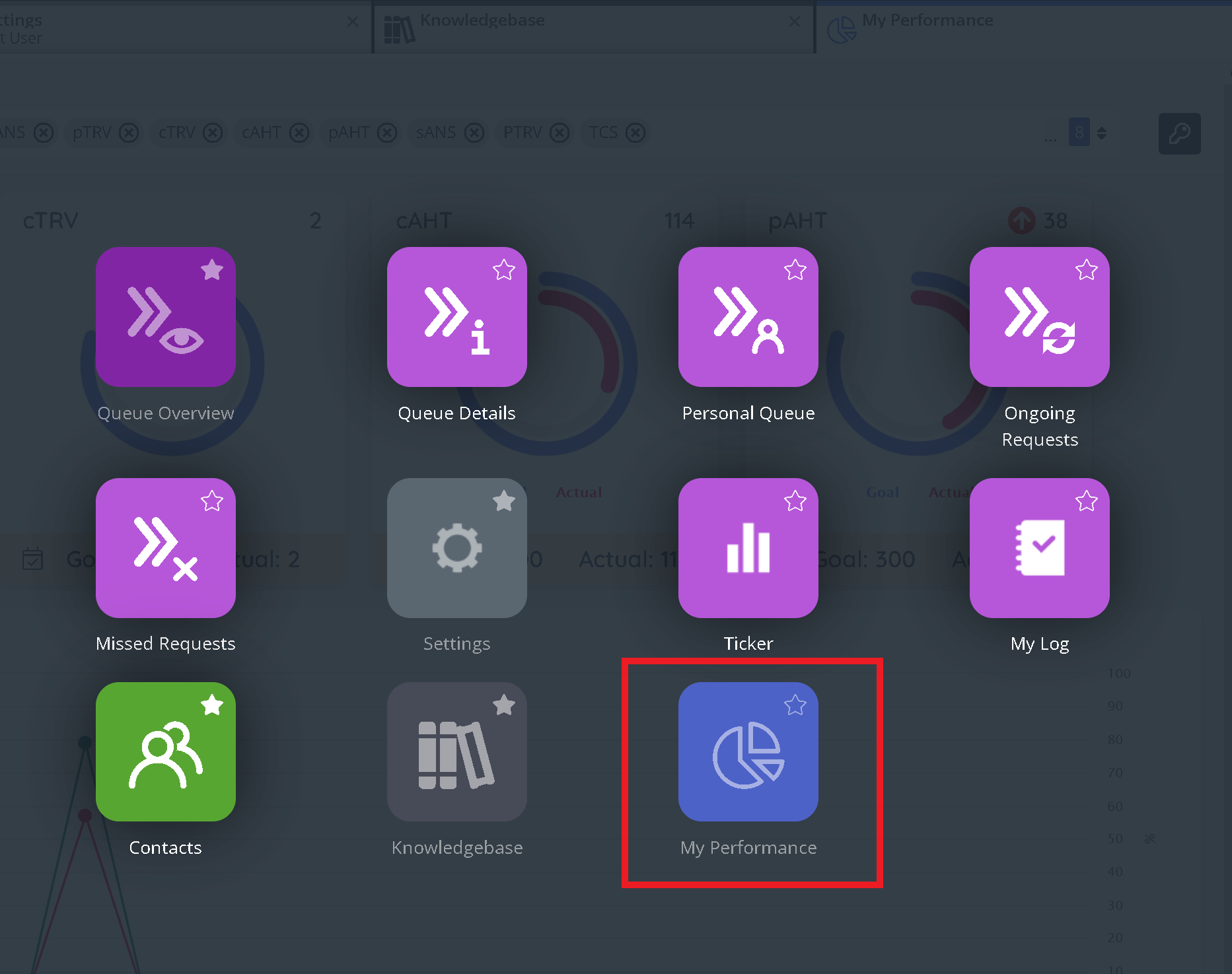
The tab menu 'My Performance' is accessible as a menu item where an admin user of the solution has configured it to be visible. Clicking on the menu icon will open the tab containing the widget.
My Performance Widget
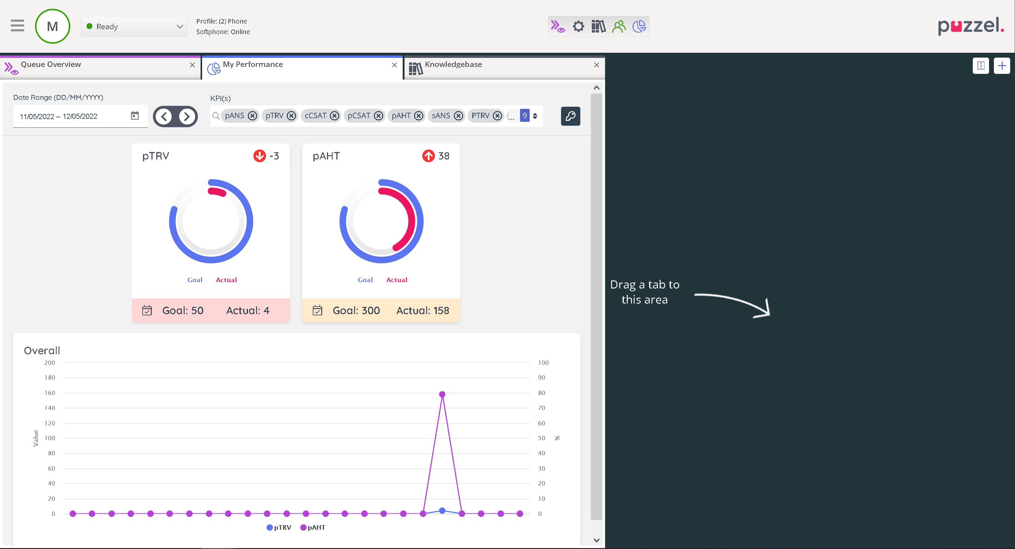
The widget presents an overview of all KPIs and additional performance results (explained below) for the logged on agent. The results displayed are confined to the last 7 days be default.
Top Nav

The date range selection by default will show the last 7 days and can be changed using the date picker.
The KPI dropdown selection defaults to the KPI selected from the previous page. The selection can be modified using the dropdown by checking or unchecking from the available KPI list. The page reloads after the selection is modified.
The key icon shows a legend of the colours displayed at the bottom of the KPI Cards which maps to your KPI settings based on the definition for Good, Needs Improvement or Bad results.
KPI cards
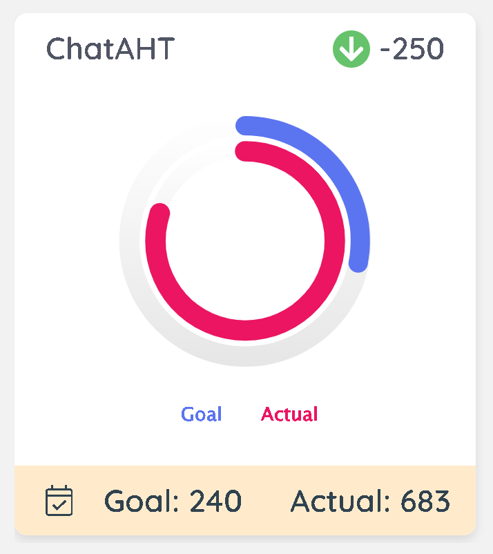
Top left:
Displays the short name for your KPI
Top right:
Displays the trend direction and colour based on value preference in the base metric from which the KPI is derived. For example. AHT values are set with lower value preference, as such downward arrow is desirable and shown as green. A trend arrow is displayed only if there is data available from a previous period as compared with the current period being. For example if you are viewing data for last week, the trend direction is based on a comparison with a week prior to that. The numbers displayed shows the actual difference as compared to that previous period so that you can see the change amount.
Middle:
The radial chart shows the goal value and the achievement (Actual). Hovering on the respective radial bars will display the numbers for Goal and Actual as defined in the KPI configuration relevant for the period you are viewing. If there are more than one goal set for the selected date range, only the last / more recent goal is used for the results.
Bottom:
The bar displayed at the bottom shows a details icon, when clicked it shows the Goal name associated for the selected period and the effective date as configured in the KPI. The colour of the bottom bar corresponds to the result as per the definition of the KPI and mapped to Good, Needs Improvement or Bad and is calculated from the actual value.
Line Charts
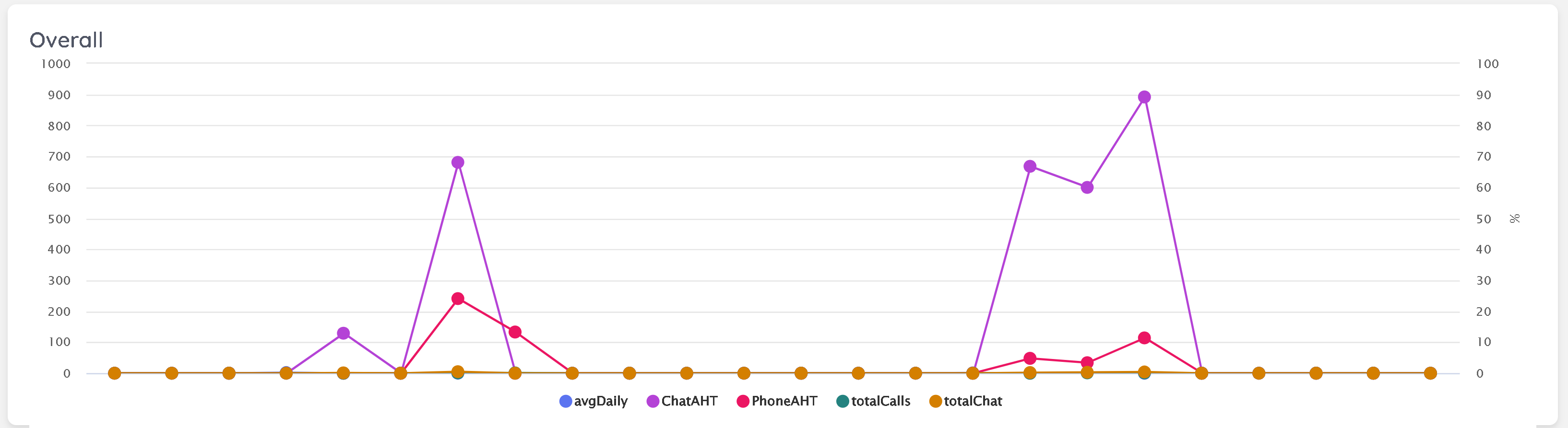
The line line chart displays an overlayed performance results across the selected date range for each of the selected KPIs so that you can see where the significant changes occurred. Individual KPI lines can be toggled to hide/ show by clicking on the legend at the bottom of the chart, and the datapoints can be hovered on to see the actual values at that time. The axis on the left shows the actual numbers for the relevant KPIs, and the right axis shows the percentage scale for those KPIs that output a percentage.