Performance Results
Visualisation of results
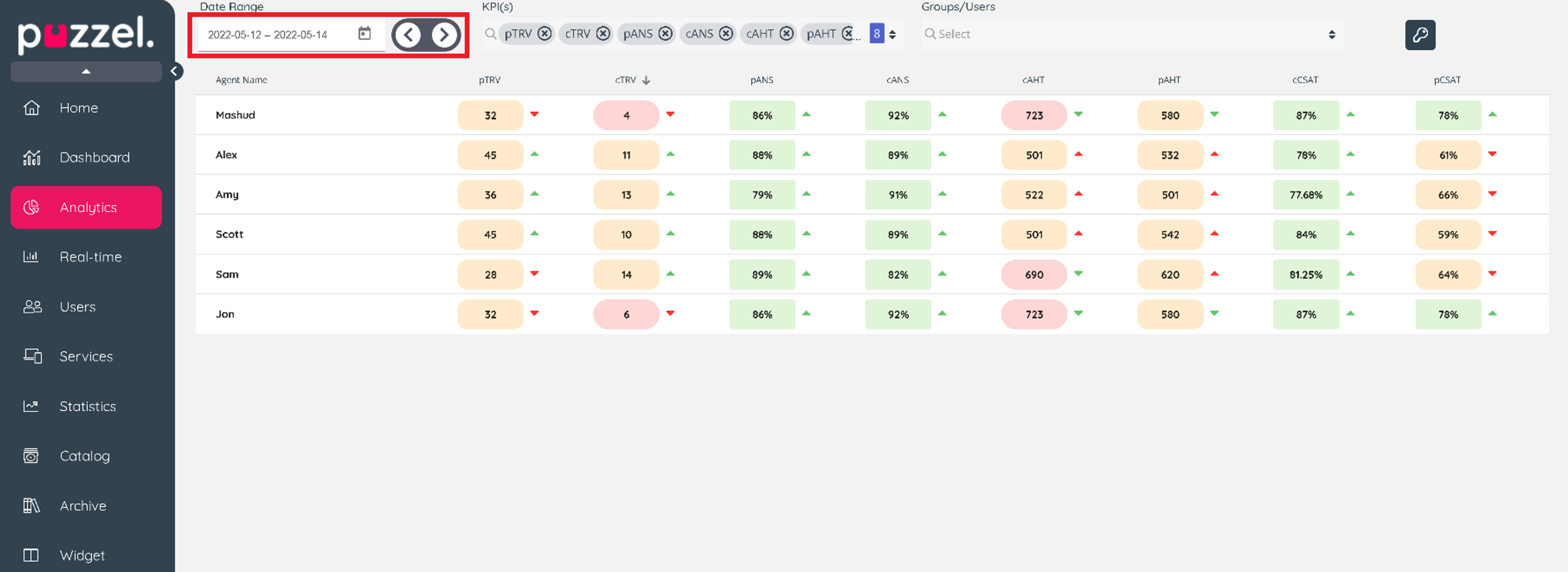
Choose date range to visualise results data.
You can choose a single day, week, month or any custom ranges to visualise the results.
The previous and next button icon allows you to navigate easily to a previous period based on your current selection. For example, if you are viewing yesterday, then the previous icon will load results for the day before.
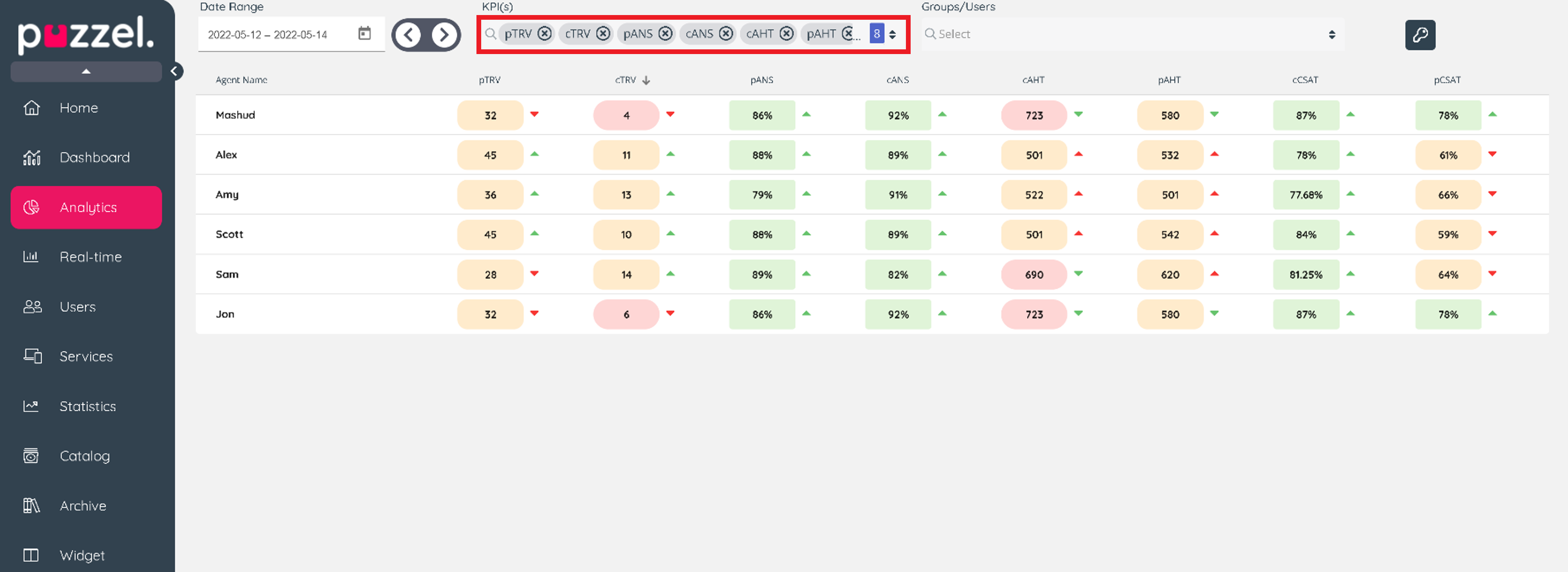
Choose KPIs
The drop-down list displays all available KPIs, you can multi-select as necessary. Any addition to your selection will be loaded and appended to the table from the last column.
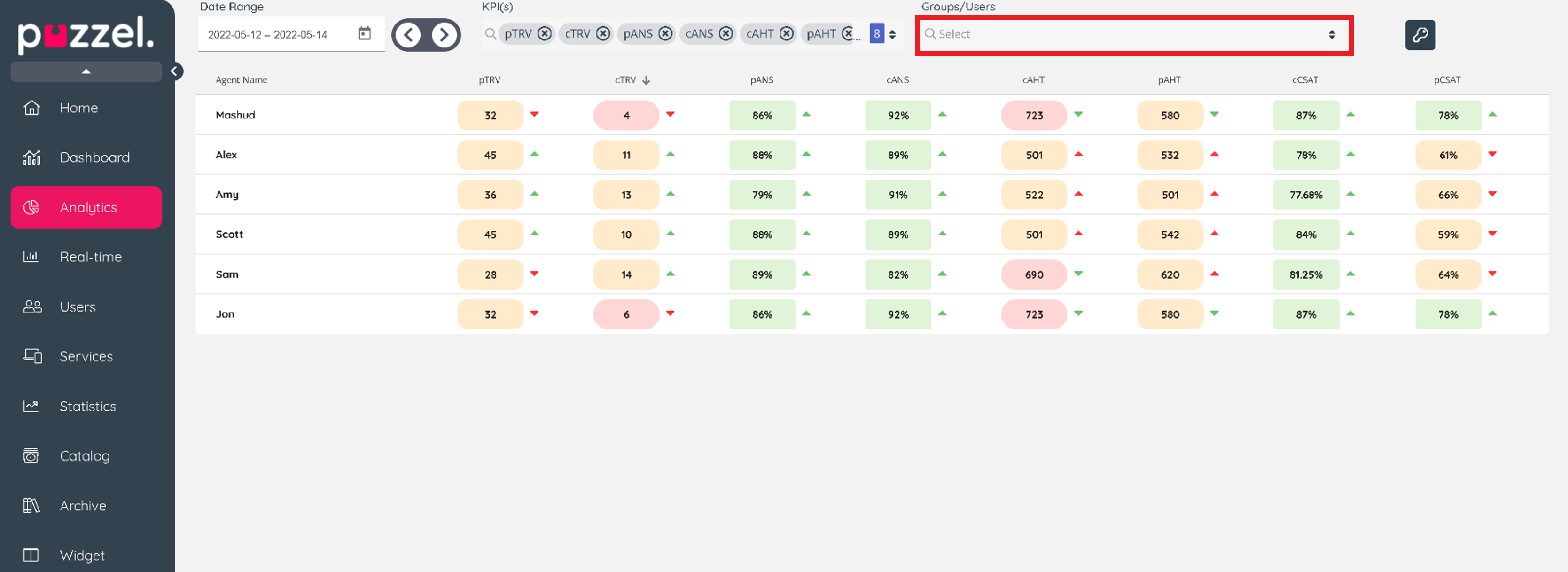
Choose Groups or Users to filter the results
The drop-down list displays all user groups and users that are visible for you and can be used to filter the results.
Trend in the results
Depending on the Base Metric for the KPI, a higher or lower value may be preferred when comparing to a previous period. The direction of the arrow indicates the trend direction when compared to a previous period from your selected period and the colour of the arrow indicates if this is desirable or not. A green arrow is a desirable outcome, and a red arrow indicates an undesirable outcome.
- if higher value preferred on goal setting and current value higher than last period = up green
- If higher value preferred on goal setting and current value less than previous period = down red
- if lower value preferred on goal setting and current value lower than last period = down green
- if lower value preferred on goal setting and current value higher than last period = up red
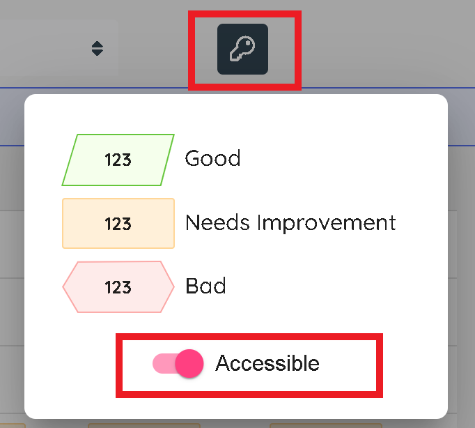
Score definition and accessibility
The key icon displays a a definition of the colour codes and an accessibility toggle to change the layout of the results visualisation shapes.