
Tab Configuration
The tab configuration mechanism is provided in the following menu:

It is responsible for defining new widgets, which can ultimately be exposed in the new Agent Application. In the new Agent Application, each tab contains a set of widgets, which handle some specific task such as Chat, Email, or Phone.
There are two types of tabs, depending on whether they are customizable or not - these are the Core Tabs, which are not customizable, and the Custom Tabs, which are customizable.
For all customizable tabs, you can:
- Create a Tab
- Edit an existing tab
Creating a new tab
To add a new Tab to the list below, simply press the  button, located at the bottom of the page.This will add a new empty tab in the list. The next step is to enter a name, associated with this tab.

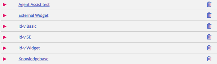
Once this is done, this tab can be saved via the “Save changes” button demonstrated above. Then, the tab will be rendered as a standard link with text in the tab list of the section. This looks as shown below:
Editing an existing tab
To edit an existing tab, or customize a tab, which was newly added, simply click on its name. This will open the tab and expose the user interface, which will allow you to customize it further. It looks like this:
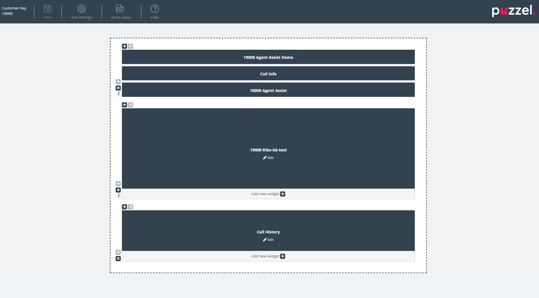
This layout consists of two sections:
- The header, which contains the “Save” button, along with the “Tab Settings” section, the JSON Editor button and some help information in the “Help” section
- The main area, which contains the main layout, where all widgets are located.
Saving changes
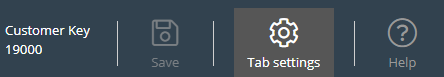
Within the tab header is located a “Save” button, which is used to save the current changes on the layout. By default, when there are no changes, it is disabled. As soon as there are some changes applied, it is enabled and also provides a visual indication that there are unsaved changes on the layout:

Tab settings
The Tab Settings icon is located in the header of the tab editor, as show here:
It contains a group of settings, related to the tab as a whole. When clicked, the settings tab is rendered as follows:
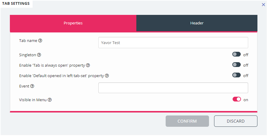
The settings which are available on the “Properties” tab are:
- Tab Name - specifies the name, which will be used for the tab
- Singleton - a Boolean value, specifying whether there can only be one instance of the tab
-
Enable 'Tab is always open' property – determines whether the tab stays open at all times. This property, when enabled, becomes visible in the admin section.
-
Enable 'Tab is always open' property – default value – the value associated with the 'Tab is always open' property. This property, when enabled, becomes visible in the admin section.
-
Event - the event, which triggers the tab
-
Visible in Menu - whether or not this tab will be visible/selectable from the menu
For the header section, these are the properties available:
- Title - The name/title for the tab
- Information - Additional information for the tab
- Icon class - the name of the class, which will be used to populate the icon
- Color - Should be hex, rga/rgba color, which will be used for the Tab Header and add tab modal title
Adding widgets
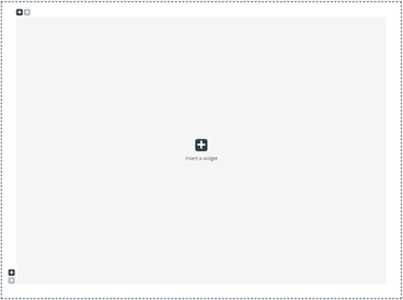
One can add widgets on the layout only in an existing container. This can be done either in a completely empty container, or a container, which host less than three widgets:
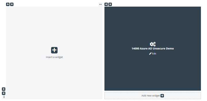
As shown in the screenshot above, one can use either the “Insert a widget” button, or “Add new widget” one.
Once one of these buttons are clicked, the menu for adding widgets is show:
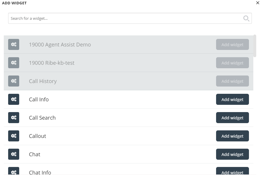
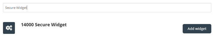
At the top is located the search bar, where one can enter the name of a particular widget, or just a few letters from its name. Based on this, matching names will be displayed under it, as show below:
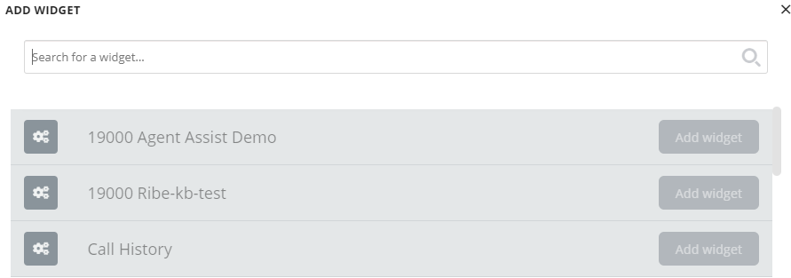
To add the widget to the layout, one needs to simply click on the “Add widget” button. Please note, that widgets that are already assigned to the layout, cannot be added again. These will be greyed out like this:
Once you click on the “Add widget” button, you are presented with a final step to configure the widget:
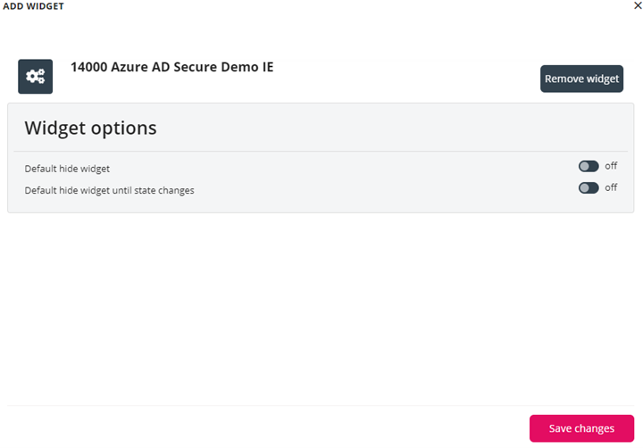
On the screen above, one can set two properties, related to the visibility of the widget on its first load. Also, one can click on the “Remove widget” button, which take one to the list of widgets. Alternatively, one can either close the popup, which discards all changes made so far, or save the changes via the “Save changes” button.
Removing Widgets
Removing widgets from the layout is straightforward. One needs to simply hover over a widget, until the “x” button is shown, on the top left:

If this button is clicked, a warning confirmation is displayed:
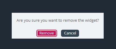
If the “Remove” button is clicked, the widget is removed, and the layout cell becomes empty.
Editing a widget
If one wants to edit a widget, this can be done via the “Edit” icon at the centre of each widget, as shown below:
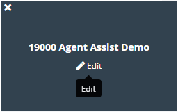
When clicked, the edit dialogue is the same as when adding a new widget. It offers options to edit properties of the widget, as well as add a new widget in its place, close the dialogue or save.
Understanding the tab layout
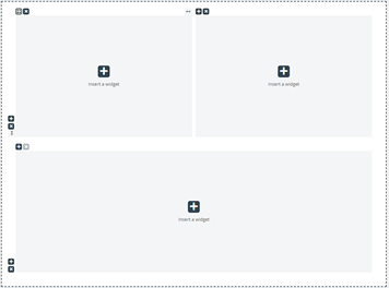
This section includes more information on the widget layout – the pane, which host all widgets. In a new tab layout, there is only one cell or container where one can place widgets:
In addition to inserting a widget in this cell, one can also add more cells to the layout. This is done via the “+” signs on the bottom left and top left of the container. The bottom “+” sign adds a row and the top one adds a column to the layout.
In the layout above, if one adds one row and then one column to the first row, the layout will change to:
The current limit for the numbers of rows and column is 3, which means that one cannot add more than 3 by 3 rows/columns.
One can delete any layout cell via the “x” button rendered on the top left of the container. If it is greyed out, or disabled, this means that the container cannot be removed – since there is a limit of at least one container for the layout.
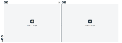
Another important aspect of the layout is the resizing. Each column and row can be resized – as long as it has a neighbour cell of course. Resizing is done via hovering over the border between two cells, until the resizing handler appears. Below is demonstrated a resizing handler between two columns:
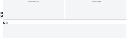
Alternatively, this is the resizing handler between two rows:
To start resizing, simply click on the resizing handler, and drag it as far left/right/top/bottom as needed. Then simply release it.
When resizing two columns, there are two things to note. First, above each column, there is a number, indicating the relative percentage that this column currently occupies:
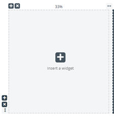
Another thing to note is that the resizing is not fully smooth, but rather snapping to steps of 5 percent increments or decrements. This snapping area is denoted by the dotted lines around each cell.
Resizing rows is very similar to resizing cells/columns – simply without the snapping of predefined sizes. This looks as shown below:

Moving the horizontal resize ruler up and down resized the two rows. The new dimensions are noted on the left of each row, in percent.
Editing Tab Configuration via the JSON Editor
Once you have configured a complete layout, one can also edit this configuration directly via code. This is possible via the capabilities of the JSON Editor. In essence, the JSON Editor offers the option to directly edit, in code, an existing Tab configuration.
Please note, that by using this mode, one enters the so called "Expert Mode", which requires good understanding of the JSON structure of the configuration, as well as its individual properties.
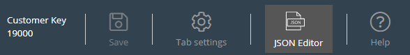
The JSON Editor is triggered via the button in the header, highlighted below:
When the Editor is enabled, it renders the code from the configuration, directly editable as a JSON-formatted block.
This is demonstrated below:
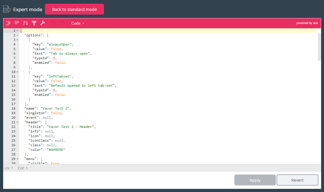
In its header, the Editor emphasises that you are now working in Expert mode.
In this mode, you can directly edit the configuration and apply all needed changes. Once done, you can:
- Click the "Apply" button at the bottom to save the changes, or
- Click to "Revert" button to undo any changes applied so far
Additionally, one can simply go back to the "Standard" mode of the Widget Tab Editor, by clicking on the "Back to standard mode" button in the header.