
How to design a panel
The panel is one of the interaction options offered when choosing to add a new interaction. The standard panel has the following fields:
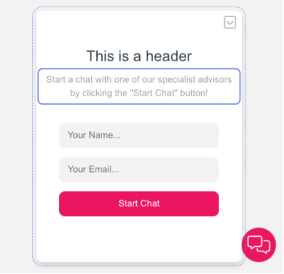
- The header
- The message for the customer
- Input fields
- A button to begin the chat.
Editing specific panel elements
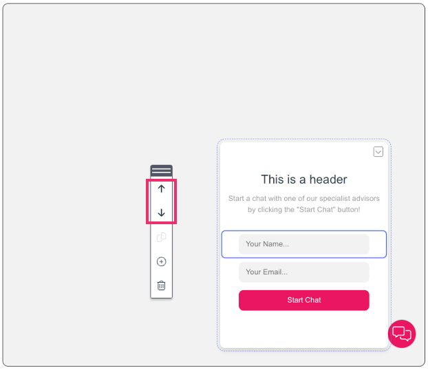
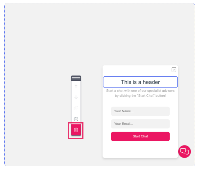
There are various editing options available for users including, through the editing sidebar which you can drag and move around the preview space by clicking on the ellipsis button and moving it on screen. To edit and element you will need to click on the specific element on the panel and:
1. Select an option to move the element upwards or downwards.
2. Click on the bin icon to delete the element.
Editing the panel’s design
To modify the panel element’s design, you can:
- Click on the element.
- Navigate to the Design pane.
The available design options are the following:
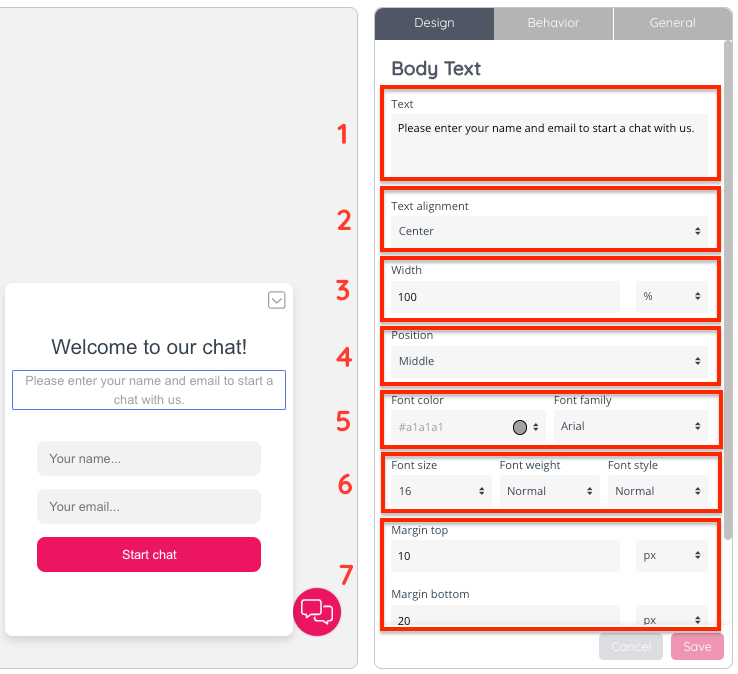
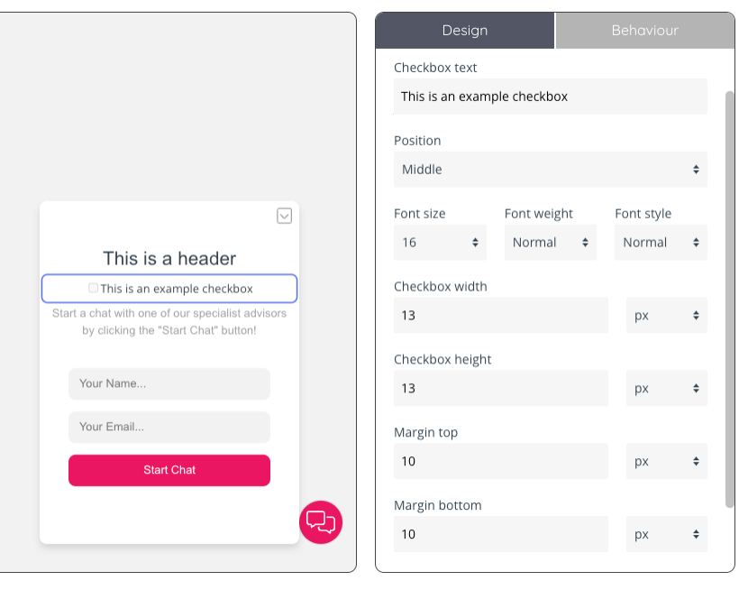
- There is a section to edit the text of the text box. In the example of input fields, there is a placeholder text which you can edit (i.e.: “Your name…” or “Your email…”)
- This drop down give you the option to align your text to the left, centre or right
- Configuring a width by inserting a numerical value in the relevant field and choosing an option from the dropdown to the right, among: %, px, em and rem.
- Positioning the element to the left, middle and right
- Choosing a font colour for the element by clicking on the dropdown button, or editing the field with a colour code. Select a font family of those available in the dropdown menu
- Select a font size, weight and font style
- The margin top and bottom fields allow you to configure how the text will appear within the panel. You can insert numerical values and choose the measurement from the dropdown menus to the right.
Adding elements to the panel
There are various elements available for you to add to a panel, through the editing sidebar which you can drag and move around the preview space by clicking on the ellipsis button and moving it on screen. To add an element, you will need to click on the plus icon on the editing sidebar:
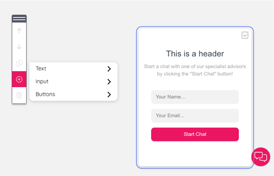
The available options are:
A. Text
a. Header: this will add a header text box that you can move around the panel
b. Body text: if you would like to add more body copy, this text box allows you to modify as needed.
B. Input
a. Name, email and phone filed are fields that are predefined and expect a certain input format, for example an email address. The input field is a generic input field. This populates an input box where users can insert information relevant to their chat interaction.
b. Deny archiving checkbox: insert this checkbox to allow the end user the option to deny the archiving of the chat conversation transcript.
c. Checkbox: this option allows users to insert a checkbox and customise the text.
d. Queue key drop down: A predefined drop down which can be populated with available queue keys available in the contact centre.
e. Dropdown: A generic drop down which can be populated with values.
C. Buttons
a. Button
b. Close button
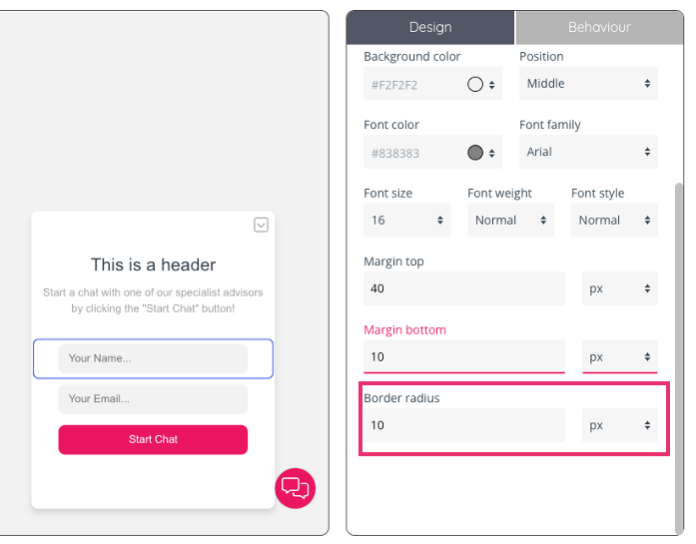
Additional design options for other panel elements
For input fields, there is also an option to configure the border radius by inserting a numerical value and choosing a measurement from the drop-down menu.
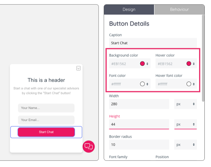
When editing the button’s design there will also be options to edit the:
- Background colour: the colour that appears as a background to the button’s text.
- Hover colour: the colour that appears as a background to the button’s text when the cursor hovers over it.
- Font colour: the colour of the text’s font
- Font hover colour: the colour of the text’s font when the cursor hovers over it.
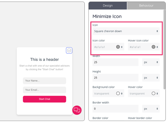
The minimise icon features design options to choose the icon type among the options in the drop-down menu, as well as the icon’s colour and the icon’s colour when the cursor hovers over it.
To edit a checkbox, you can specify the position, width and height alongside margin settings and customising the font.