Reports Dashboards Optimization Tips
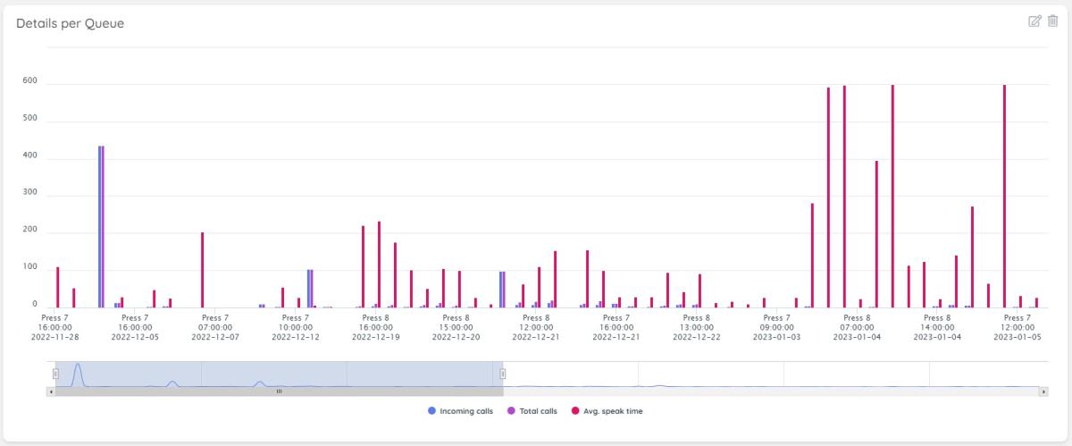
Currently, the chart visualisations support all data available from reports. To accommodate this, we are rendering both a chart, which shows one or more series of data and a range selector at the bottom of the chart, to allow selection of a specific subset of data:
If you want to focus on a very small subset of the data, simply resize the bottom section - this will auto-adjust to show only relevant data, base on this selection.
For example, when a widget renders initially, it may look something like this:
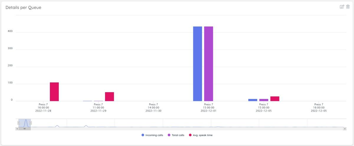
If you want to focus on a specific range - for example, the initial graph spike on the bottom left, you can simply resize the range selector:
This allows you to focus on a much smaller set of data points to inspect further and show the tooltips related to this data.
Further optimisation points are listed below.
Reducing Data Sets per Widget
One way to ensure that the Dashboard information is easy to look at and interpret is to break larger data sets into smaller selections, which fit easily into a single widget each. For example, if the data set for a Details Per Queue Report for the past few months is too big, this can be broken down into individual Months.
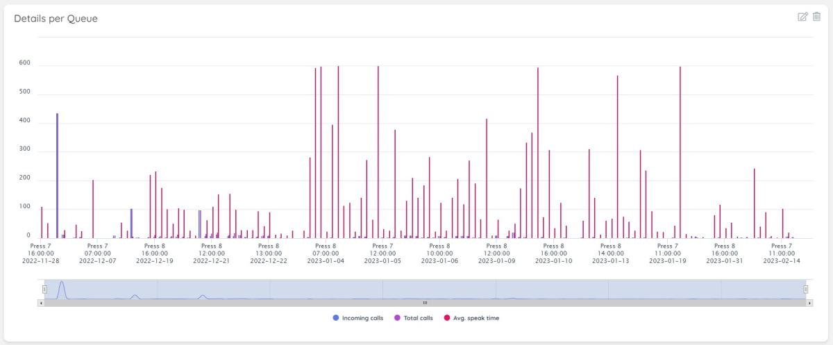
Let us see what impact this can have. In the layout below, you can see all the information rendered at once:
Some disadvantages of the layout above is that one needs to scroll to see all the data.
Additionally, to save some space, the chart plugin may not be rendering all data along the X Axis, in data-intensive scenarios.
If, instead of plugging all data, we break the data set into a monthly set of values, this will look much more clean and organised:
Table Layout - Utilise Grouping
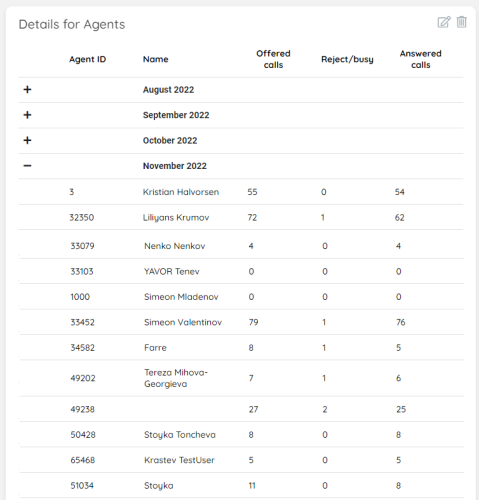
When visualising data in a grouped layout - for example by month, or week, we render the table to include collapsable divs that contain the data per period. This makes it very handy, because you can collapse one period and review the next one. This layout looks like this:
As you can see above, each period, when collapsed, take up a very limited amount of space. At the same time, one can easily expand it, to review another period ot fime for more details.


