Widget Administration
This section of the Administration Portal, allows for two important functions:
- Enabling or disabling visibility for a specific widget for the current customer
- Adding or editing widgets and its properties
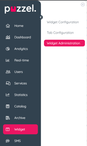
The tab menu looks like this:
Adding a new Widget
To add a new Widget in the list, simply press the Add Widget.
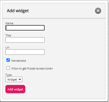
This will prompt you to enter the following fields:
- Name this is the name of the widget
- Title this allows you to enter a title, associated with the widget, which can be a little bit more descriptive
- URL this is the URL, to which the iframe will point
- Handshake - Sets default value of handshake to enabled. See handshake section below for more information
- Allow to get Puzzel access token - Sets default value of canGetAccessToken to enabled. See canGetAccessToken section below for more information
- Type - Either Widget or Search. Search is used for adding a custom search source
Once these values are entered, you can press the Add Widget button within the popup and finalise the settings.
Adding properties to a Widget
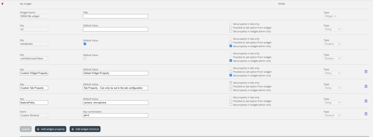
Once a Widget has been created and added to the list, properties can be added to it. These properties will then be available for the widget to consume from the Agent Application and the option to be configurable from the Widget Configuration page. Here is an example of a widget with properties:
To add a new Widget property, simply press on the Add Widget property button. This will trigger a popup form, which contains the following values:
- Key this is the string value, associated with a key for this widget. There are no restrictions on what one can enter, with the main goal being of making this a meaningful key
- Default Value this is the default value for the key. If no other value is set at a later time, the key will have this value
- Type this is the type of the property being added. The available values are:
- String this is a standard string, which can accept any string of numeric or text values
- Drop down this presents a drop down element with options to choose from. Useful for situations, where one needs to present a set of mutually exclusive options
- Password this is a value, which presents a password field. This is masked initially, however an administrator can set a different value from the Widget Configuration section later
- Boolean this creates a checkbox field, which similarly to a Boolean field can be checked or unchecked
- Integer this creates a numeric input field, which accepts numbers only
- Set property in tab only means that the value for the key is set and read within a tab scope when configuring the tab under Tab Configuration. Different tabs that uses the widget can have different values for the key whereas if unchecked the key is global and is set on a widget scope which is the default behaviour.
- Possible to set option from widget allows the widget to update the value of the key. If disabled the widget can only read the value.
- Set property in widget admin only disables the possibility to change the key value from Widget Configuration. The key value can only be changed from Widget Administration.
- Event - Uses the "Add widget shortcut" button. Triggers the entered Event when a key combination is pressed. Used for keyboard shortcuts. Requires that the widget uses the Widget API Library.
System properties and keys
Widget Name - The system name of the widget with the syntax of "{{customerKey}} {{Widget Name}}". This is used by back-end functions and can't be changed, however the title of the widget can be changed and will be shown in the Agent Application.
It's also possible to enter a blank space as title to remove the title fully from the widget.
Key - url - The URL that the widget loads. Can be changed.
Key - handshake - Used to signal to the Agent Application that the Widget is ready to receive events. Is handled by Widget API Library if the Widget uses the library. Good to use for single page applications built on for example Aurelia, Angular or React where the Window load event is not a reliable method to use to signal that the Widget is fully loaded.
Key - canGetAccessToken - Needs to be enabled to be able to use the function auth.getAccessToken to retrieve an active authorization token that can be used to make API-calls to the Puzzel Contact Centre REST API.
Key - featurePolicy - Feature Policy is used to add permissions for the widget to allow it to use features that would otherwise not be permitted for an iframe to use. For example there may be a need for the widget to allow copy to clipboard or use the microphone. You can read more about feature policies here.


