
Adding a Reports Widget
You can add a custom historical report to a Dashboard widget from page Statistics - Reports (Add to Dashboard), or you can add a historical report widget to a Dashboard from the Dashboard page, and do the customisation here.
The process of adding a Reports widget to a Dashboard is similar to adding any other widget type. It follows the three standard steps:
- Selecting a Widget Type
- Configuring the widget
- Preview and visual settings
Selecting a Widget Type
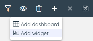
When you have the relevant Dashboard active, click + and select "Add widget":
Then select the Historical Reports widget:
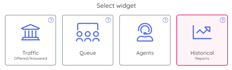
Then click Next to go to step 2.
Configuring the Historical report widget
First, in the left column, select the standard report you want to build your widget based on.

Once a report is selected, all of its configuration data is loaded to the right in the Settings part, as shown below:
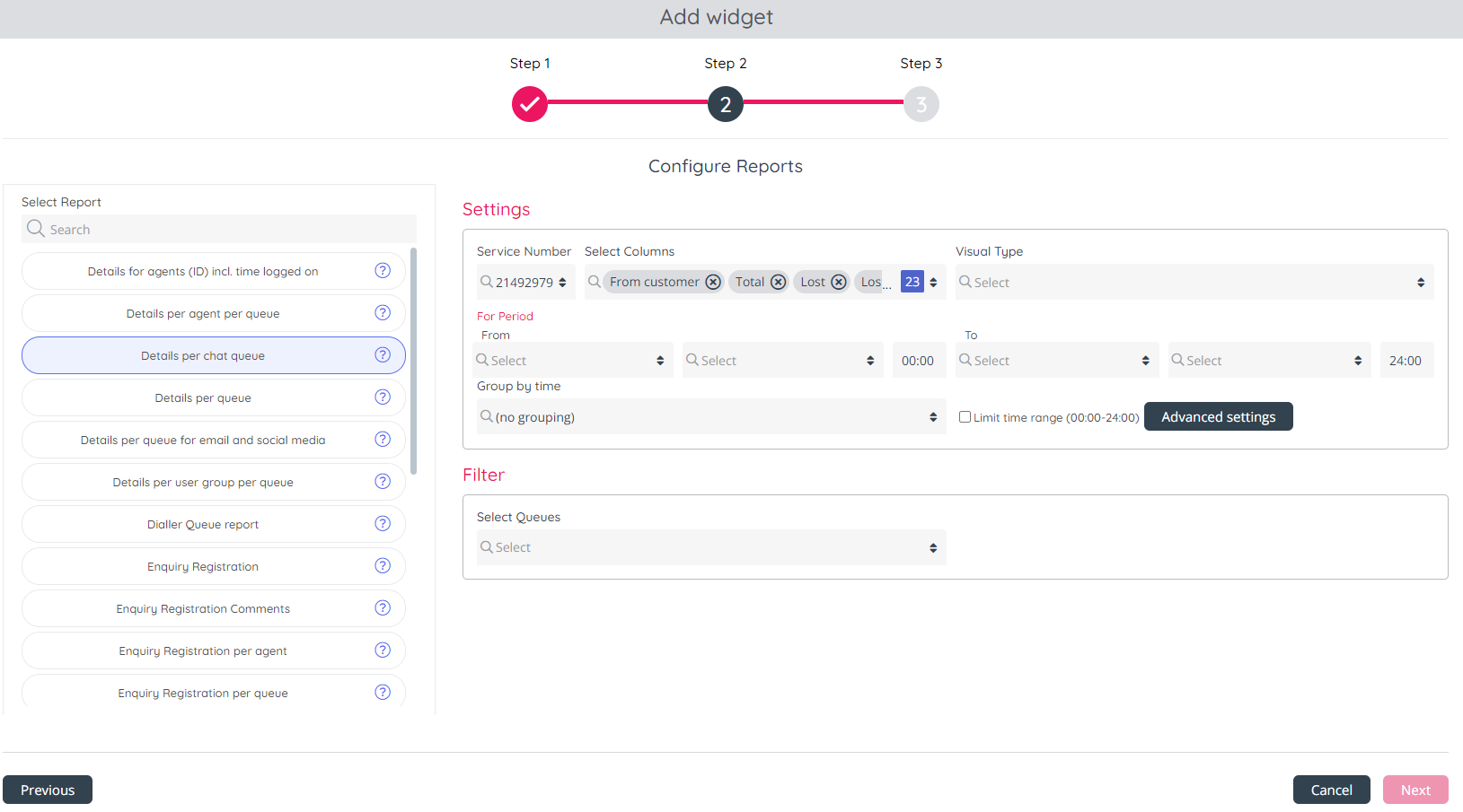
The configuration options are a 1:1 correspondence with existing Reports settings, to minimise the learning curve and preserve the user experience.
For completeness, these are listed below:
- Service Number - if you have more than 1 Service number and you don't want the 'default' service number, please change Service number.
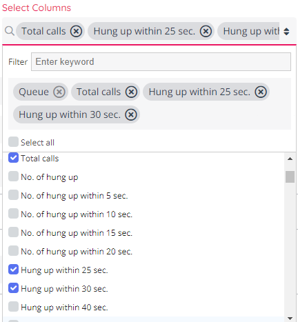
- Select Columns - all columns that are shown as standard in the report are ticked, and you can remove (standard columns) and/or add optional columns as you like. If you select more than 4 columns, the report can only have Visual type = Table.
Please note, that for each report, there may be one or more Column Keys - Columns that are pre-selected (like agent, queue, user group) and cannot be deselected, in order for the report to be properly visualised. All other columns can be selected or deselected, as in a standard widget.
- Visual Type - this section allows one to select the type of visualisation to show the data on - Line Chart, Bar Chart, Area Chart or Table.
This looks as shown below: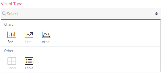
Also, it is important to mix data that is comparable with one another, in chart series - for example integers and integers, and not integers and time, which would produce renderings that are not symmetric. - Period - From: This is a relative date, such as "Today", or "Yesterday", which will be evaluated at the time the report loads, based on the date when it loads, to determine the exact translation of "Today" or "Yesterday". This is the start date range for the report.
Select between Today, Yesterday, This week, Last week, This month, Last month and January this year.- If you select Today or Yesterday, you need to select a time of day, and the default is 00:00.
- If you select This week/Last week, you must select a Weekday (e.g. Monday) and a time of day (usually 00:00).
- If you select This month/Last month, you must select a Date (e.g. 1) and a time of day (usually 00:00).
- Period - To: This is a relative date (and time) that must correspond with the selected From.
- If you selected From Yesterday (or Today) at 00:00, then select To Yesterday (or Today), and the typical To time is 24:00
- If you selected From Last week/This week and Monday at 00:00, the typical To is Sunday at 24:00
- Group By - default is no grouping on time, but for selected reports it's possibly to group the data by time, e.g. a report for a day can be grouped by hour, and a report for a week can be grouped by day.
- Filter - an option to select one or more "rows" (queues, agents, access numbers etc depending on type of report) if you do not want to se all rows. This is similar to Row filter on page Statistics - Reports. If nothing is selected here, we will show all rows in the (queue/agent) report, unless there is a resource filter limiting what queues/agents to show assigned to the user that sees this Report widget. If you actually select all rows in a queue report here and save it, and a new agent/queue is created, this new agent/queue is not automatically added to the report.

Preview and visual settings
The last and final step from the configuration of the Reports in Dashboards is choosing the Theme and Visual settings.
As with other widget types, this follows the standard interface shown below:
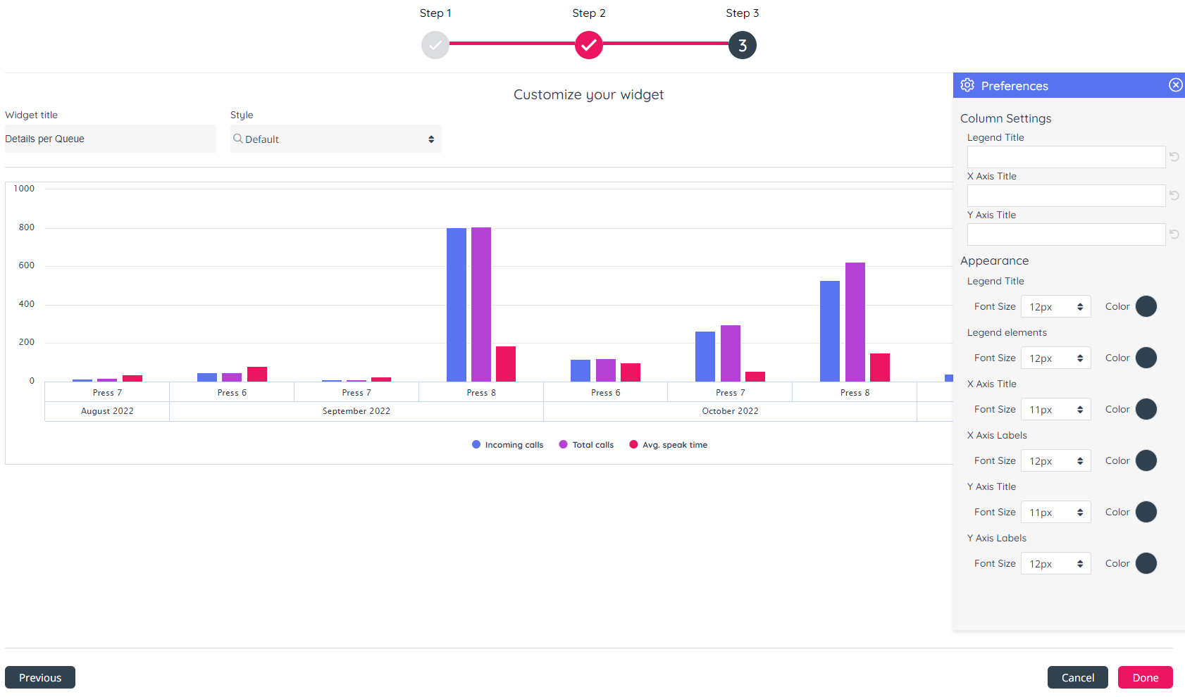
Here you can set the Theme, as well as visual settings for the widget, such as Fond Size and Colour.
Report Widget View
Once the widget has been fully configured and rendered, it will look like this:

In the case of a Chart widget, at the top you see a chart representation with one or more series.
At the bottom, you can see a range selector, which allows you to zoom-in on a specific range within the series.